- Client
- Atulya Raj, Jahanvi Chawla
- Discipline
- Branding, Art Direction, Copywriting
Brief
The Context
During their entrepreneurship module two of my seniors Atulya and Jahanvi, set out to create a business which targeted the root problem for every young designer and creative who needs stationery.
Stationery which is niche and isn’t available on Blinkit, Zomato or any other quick commerce platform. They took initiative to build their own and wanted help with building a world for their brand while they figured out the supply chain and raising funds.

The Challenge
As a branding exercise. The stationery space being a largely unorganised sector with some major players using retail and some e-commerce platforms. I needed to first scope out what the competition was doing, developing a comprehensive competitor landscape to then analyse what they were doing especially in the stationery sector and what gap we can take to stand out.

Primary and Secondary competitors

The What and the How?
Our Essence
Who we are ?
A quick commerce brand with the soul of a young designer looking for the best quality stationery available.
What do we do?
We scour the markets both offline and online and find the best, niche and actually needed stationery for creatives
How do we do it?
Our Incredible team, logistics, inventory and supply chain relations. While staying ahead of the curve by look at everything from the eyes of a creative.
Why?
To reduce the friction between the joy of being creative and worrying about the actual art supplies

Narrative
A story that every young creative resonates with and a strong mission and vision for the brand. Artzy is here to be the end all be all solution for the last minute absurd stationery needs and demands that every young creative wants the answer to.
It is one of the platforms you would strongly recommend to your best friends or gatekeep, because it’s the new hot thing and you want it all to yourself.

Mission and Vision
Vision
Be the go to platform for creative supplies
Mission
Provide quality and niche art supplies through a reliable digital platform

Standing out
Building a brand which isn’t out of touch with the students and lives in the same world, feels like a young designer’s soul is talking to you across all communications.


Expression
Fun, Understanding and Just like you
We use all the words that our audience is saying even if their parents don’t fully understand them but not feel like parents who are trying to stay with the times.
Expression is our means of creating a brand that truly stands out and is as important as our visual identity. Consistency in all out communications from social media engagement to promotional materials, classes and outreach is essential for enhancing our brand presence

Building a strong foundation
A strong brand can only come with a strong foundation, Atulya and Jahanvi’s initiative root their brand in Trust, Transparency and Partnership. Which I expanded upon and built the identity which invokes those feelings.
Character
The Trusty cool friend who always knows what is cooking iykyk :)
The character is Reliable, Cheeky and Relatable
Artzy celebrates the spirited essence of being a person that everyone can trust and rely upon, while being fun to talk to and not being boring. It is playful and authentic while trying to be your go to last minute option for art supplies.

Logo
The Canvas
The ‘Canvas’ takes inspiration from the element of quality and recognition. The mark tries to encapsulate the strive of an artist to get their artwork presented in an art gallery.
It also draws inspiration from a delivery van/truck representing the ruggedness and reliability of the brand.
The logo insinuates that the the art supplies that a creative will get from Artzy will be of the highest quality and reliability

Logo Explorations
Taking everything in from the strategy the task was now to build a coherent and meaningful mark which could represent and standout as Artzy’s very own.


Constructing the logomark

What to do and what not to do


Colors
Artzy’s color palette was inspired from the basic elements that young designers use, which are paints, the primary Artzy blue was chosen to make the brand standout amongst the competition while feeling trustworthy and new.
Logos color cards gif
The paint
words


Strategy
Establishing a system hierarchy for the typography

Adding Life
Charial
Adding a mascot to Artzy’s expressive personality gave the brand a unique and recognisable look. The hand-drawn roughness gives it character and makes it cohesive to feel of Artzy as a brand.
A mix of moody and fingers stained with charcoal like all the creatives or what they pretend to be. Charial is an Indian Gharial who has a longer history than dinosaurs but is still like a kid at heart because they mature much later than the other crocodile population. The name is a mix of Charcoal and Gharial btw.
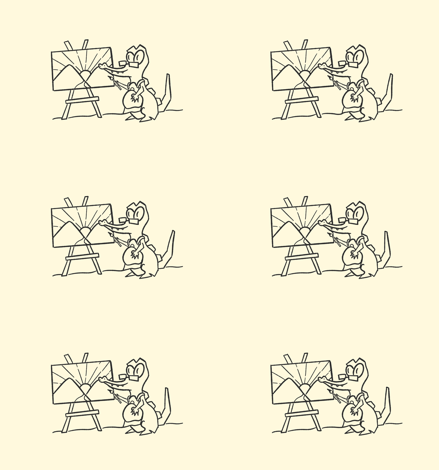
Charial Painting


Expanding the system from the brand elements
Bringing together and using the range of colors, typography, and our mascot the Charial while keeping in mind the tone of voice.


Posters


- Designer
- Udayjeet Kumar Aggarwal
- Mentor
- Rayna Batavia
Next case study
Flytbase